How Much HUD/UI to Show in a Trailer
I've long been an advocate for hiding HUD and UI elements in game trailers to increase the clarity of each shot. For example, in an action fighting game it usually doesn't make a shot appreciably better if we see a health meter which is slightly depleted when the character is hit; in most cases the shot just has to show is the fact your character can get hit. Or in a first person shooter game which has HUD/UI elements on all corners of the screen and the center, it can amount to visual clutter which is distracting.
There are some situations where removing the HUD actually decreases clarity because the game itself is rather static and the player interactions are only reflected in the HUD. In those cases I find it's good to be selective about what HUD and UI elements to show. But how do you determine which to keep, and which ones to hide?
Firstly, consider where the trailer you're making fits into the marketing campaign. If the purpose of the trailer is to give a walkthrough of the gameplay, then it makes sense to have all of the HUD/UI elements turned on, because the audience for that trailer wants the most "raw" look at what the game will be when they're playing it at home. Also, overview trailers tend to be cut much slower, which means it's less important to maximize the readability of each shot.
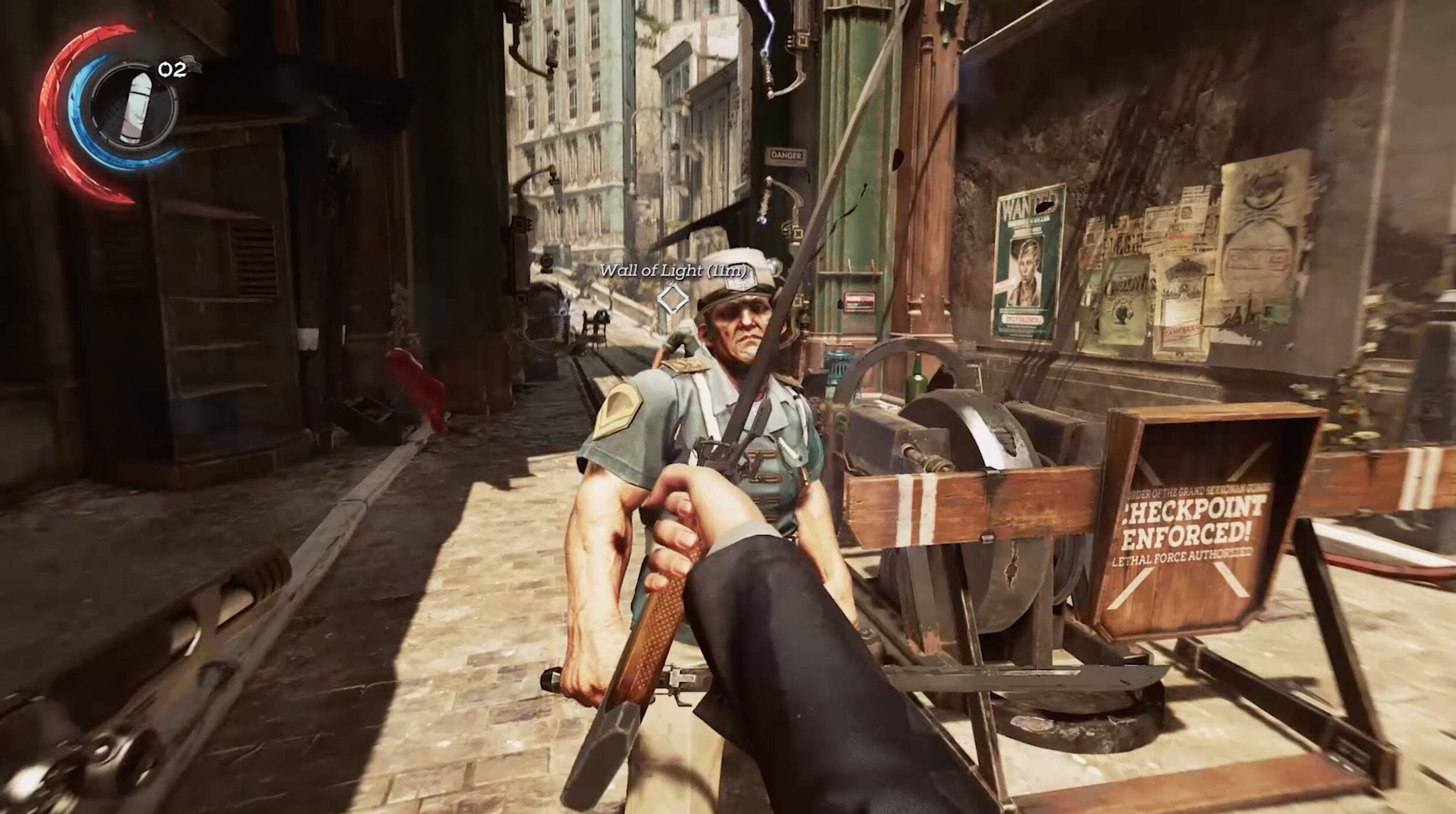
In a trailer, the waypoint indicator in the center of the screen here isn't relevant because the primary action here is sword fighting, not searching for a waypoint. The health/mana/ammunition indicator on the top left isn't terribly obtrusive, so I could see an argument for leaving it on.
But assuming the trailer you're making is a fast cut hype trailer, here are the steps I take to decide how much HUD/UI to leave on (if any):
Hide button prompts
Turn off all other HUD/UI elements
Simplify text
Consider the genre's audience
Decide based on each shot's primary action
Hide button prompts
I always at minimum turn off button prompts when capturing, because that's information important only to players at the controls, not people watching a video of the game being played. Also, if the footage is going to be used for multiple trailers for other platforms and consoles, you save yourself A LOT of work you'd otherwise have to spend recapturing (this is assuming the game doesn't look meaningfully different on each console.)
Game trailers which include button prompts in their capture usually indicate to me someone who is an inexperienced trailer editor. I understand not all developers build in the ability to toggle them off via debug options, but I highly recommend it if you want to make videos for your game.

In a trailer, I don't need to know you hold LB to view the map or view a detailed version in your inventory. I would probably remove everything except "ACQUIRED MAP"
Turn off the HUD/UI
Try turning it all off before capturing. If it's still easy to understand what is happening in the shot, then great! If however, there's a critical piece of information the HUD/UI contributes, then it's worth turning it back on. For example, if a game allows you to choose what your character says from a selection of options, a dialogue selection UI is the only way to show that. Or there might be a moment in a game where there's a pop up that says: "You accomplished [this achievement]!"
If a game has a lot of HUD/UI elements, it can be very useful to have the ability to toggle them individually. For example, you might want to see health bars, but no mini-map. Or you might want to see a mini-map but no weapon information. It depends on what you're trying to show in each shot of your trailer.
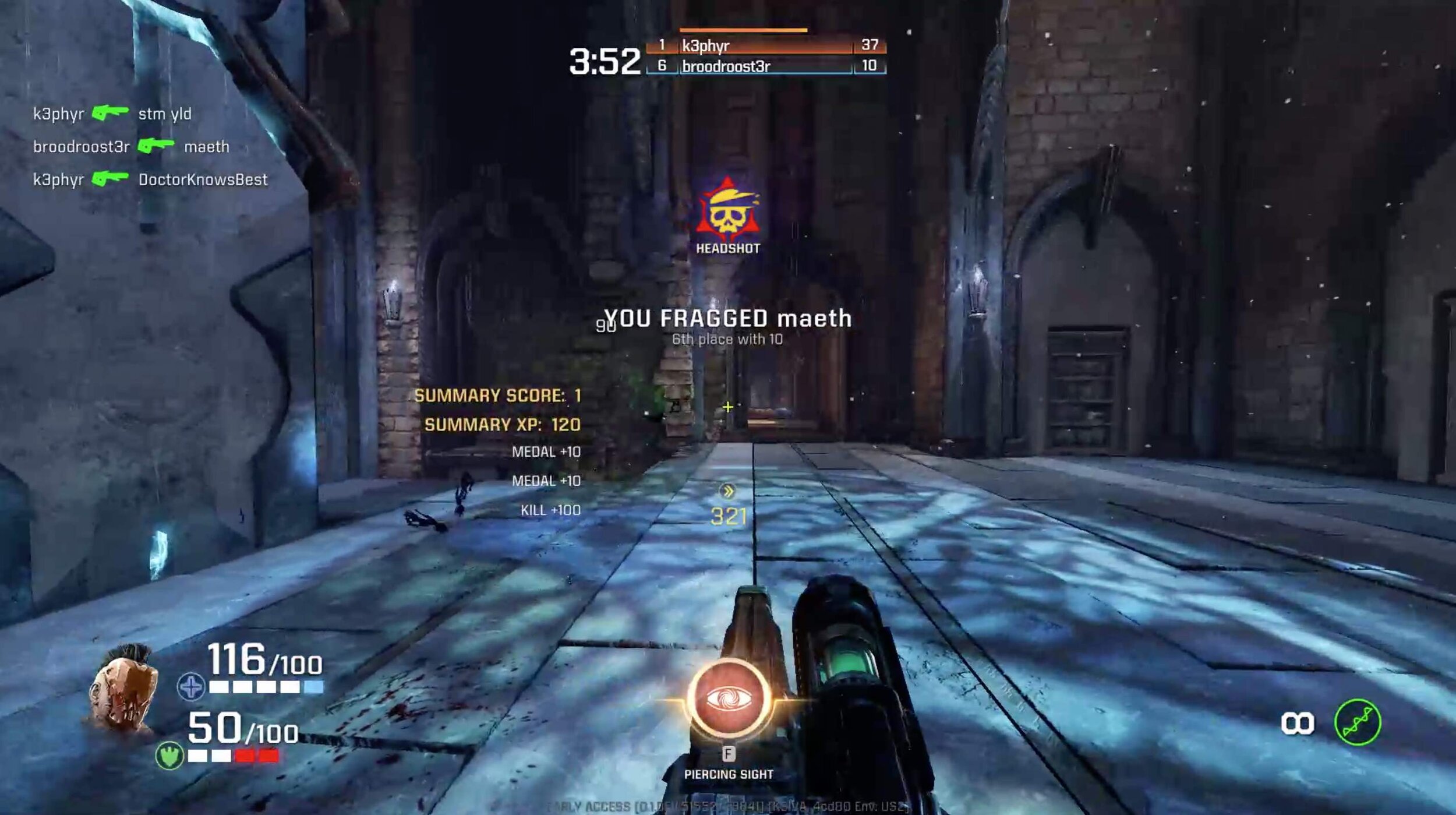
There are A LOT of things on this screen. I think the superfluous elements are the scroll of who killed who with what on the top left and the ability select on the bottom center. The rest help indicate the genre of first person shooter. Though if that was all understood at this point in the trailer I'd probably remove everything but the "YOU fragged maeth"
Simplify text
I'm almost always looking for ways to reduce the amount of text on screen in a trailer. Some screens in games have quite a lot of text in them, whether they're in dialogue boxes or UI screens which explains the game. Most of the time, the trailer doesn't need to show all of the text in every dialogue box or UI element. The key is to figure out the minimum amount of text needed to communicate the idea. For example, in the announce trailer for Supergiant Games' Hades, the screen where you select power ups just showed the names of the powers. In the full game that same screen lists the name of the power, how much damage they do, and more.

Consider the genre's audience
Some games are almost nothing without their HUD/UI elements. For example, realtime strategy games like Civilization, city building games, etc. Fans of those particular genres might be dissatisfied if they don't get to see any HUD/UI elements. In some cases, improvements to the HUD/UI could be a big selling point of the sequel. Maybe the developers found new and innovative ways to communicate information needed to play the game. I feel the more technically complicated the game is to play, the more likely it is fans will want to see all the buttons and minutiae.

If this shot is about showing you research new tech, then everything other than "Coal thumper researched!" could be removed.
Decide based on each shot's primary action.
Ultimately this is all a case by case basis per trailer and per shot. I think HUD/UI element visibility should just be one more thing to carefully consider when making a game trailer. It's easier to find the answer if you think about who the trailer is for, and what it needs to say for that particular video at that phase of the campaign.

On this screen, the most important parts are the dialogue selection and maybe the card to the left. Everything else makes this shot very overwhelming.
If you're curious about practicing developing an eye to "prune" the HUD/UI of a game for a trailer, a lot of the screens I used in this post are from the amazing website Interface in Game which is a collection of screens and videos showcasing tons of game interfaces. It's a lot of fun to look at and admire for the designs and how they fit into their respective games.
How do you feel about HUD/UI elements in trailers? Do you prefer seeing them all turned on? Partially turned on? Removed entirely? Please let me know; I'm very curious!
