My Work Is Not Yet Done Announce Trailer Review
I seldom see a game trailer so confident in its restraint, but this trailer for My Work is Not Yet Done is absolutely riveting.
The trailer opens with a quote which to be completely honest, doesn't do much for me because I'm not religious and have little to no understanding its significance. And I'm not really a savvy enough critical reader to try to figure it out in the space of the trailer. What I can identify is the outdoor ambience behind the quote which has some disarming and sort of soothing white noise.
The first shot is a building surrounded by foliage. Nothing happens but the blowing of the wind and leaves falling. The art style is striking in its lo-fi black and white. This goes for about 4 seconds then it cuts to a cigarette lighter being activated in total darkness. It then cuts to an interior location of a messy apartment. For the next 13 seconds we hear what sounds like light rain and a fly buzzing in the air.
I've seen trailers which have a lot of "action" which I found less engrossing than this. The confidence of holding on a shot where it seems like nothing is happening is what pulls me in. I'm much more interested in a static shot with "nothing" happening than if the camera were flying through a series of 3D environments which is ostensibly saying "Look how cool this is!"
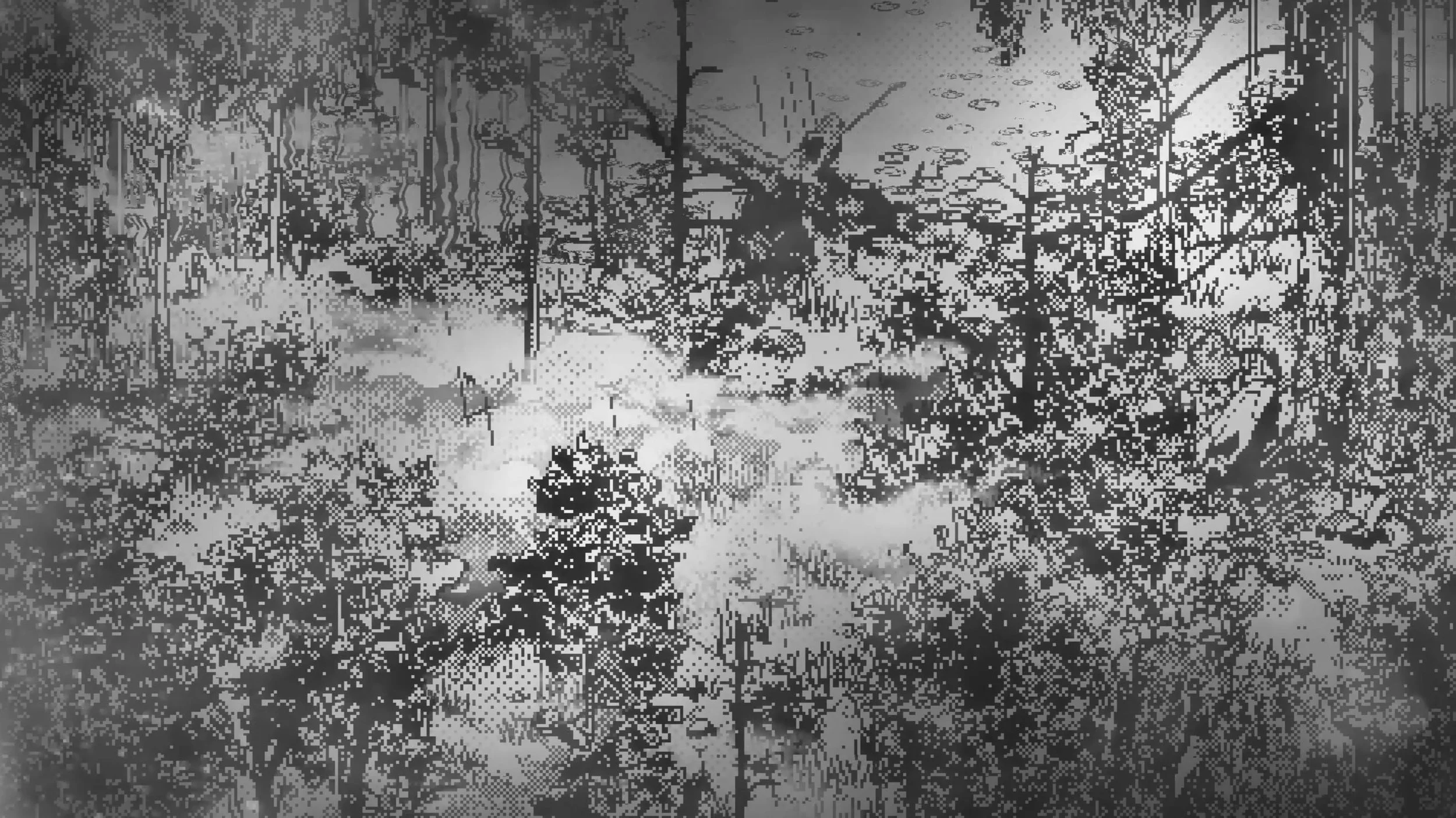
I love the foggy ambience in this shot because it's the only shot that feels this way. It makes me think there's a lot more variety in the game than they show.
There's suspense in the opening shot, and the cigarette lighter cutaway feels like an intentional bit of punctuation splicing together two long shots. After this there are a bunch of quick cutaways which intercut with this interior. The key to effective cross cutting is either not lingering in one shot for too long, or showing some sort of progression in one of the scenes.
After some cuts, we hear some additional sounds in the interior like rustling either from a machine or water. Eventually someone emerges from the shower, and we see the text "(Use shower)" on the bottom which I'm assuming is the game's UI.
Then we see a new sort of exterior which looks like a concrete barrier on a shore. There's a quick cut of what looks like some sort of targeting UI, then a person composing themselves outside a door. It then intercuts the person from the shower with some very quick cuts of more exteriors. It should be noted that there isn't a single note of music; everything is the ambient sound from the game. Coupled with the black and white graphics it creates an unsettling feeling.
Then in BIG BOLD TEXT it says "Presented by RAW FURY" (the game publisher) which is composed next to a shot of a person drying their hair and getting dressed. The logo stays up during this entire scene as they go about their day. An interesting choice is leaving the game UI on the bottom of the screen. I feel like this was done to help us understand this is gameplay and not a cutscene. Without it we'd have that question in our head of what it is we're seeing.
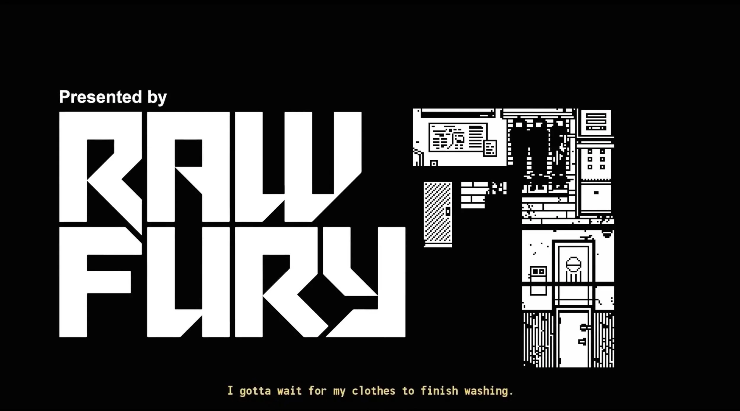
I love how they use the negative space here for a late logo. The low key game UI on the bottom is a great touch too.
The character leaves and we see a quick shot of what looks like either an easel or backdrop with photo lights surrounding it and then a shot of a cliff overlooking a gorge. For a while it seems like we're just looking at the environment, but then we see a person on the cliff moving. They undress, take a look from the edge of the cliff and then lean forward. Before we see them fall, it cuts to the title card.
This trailer is just shy of 3 minutes long, and I was fully engrossed the entire time. The sound design, rhythm of the editing, and intentional pacing tell me whomever cut this together really knew what they were doing.
Editing loaded with thought and intention is weird nebulous thing to detect. How do I differentiate between flash frame mistakes and quick cuts which have purpose? How do you know when a shot is long because of bad pacing and not because they wanted to intentionally draw out the pace? To be completely honest, I don't really know how to articulate it. But when I see it, I can FEEL it. Watching this elicited an emotional reaction, and countless other game trailers quickly bore me or don't feel worth my time.
The best editing creates feelings and connects with the audience even if they don't know exactly what's happening. I think this does that with flying colors (despite being black and white).