How to Critique Game Trailers - Ascent of Ashes
This is a rough cut for the reveal trailer for Ascent of Ashes. After I consulted on this project, it went on to get over 800,000 views on YouTube! When I was first hired, I could see it had all the parts needed, but they were shown in the wrong order. Using all the exact same footage, it went from a generic-looking post apocalyptic game to one which spoke directly to its target audience and showed its unique take on the genre.
Here's how I did it.
First, watched and here's how I broke it down shot by shot:
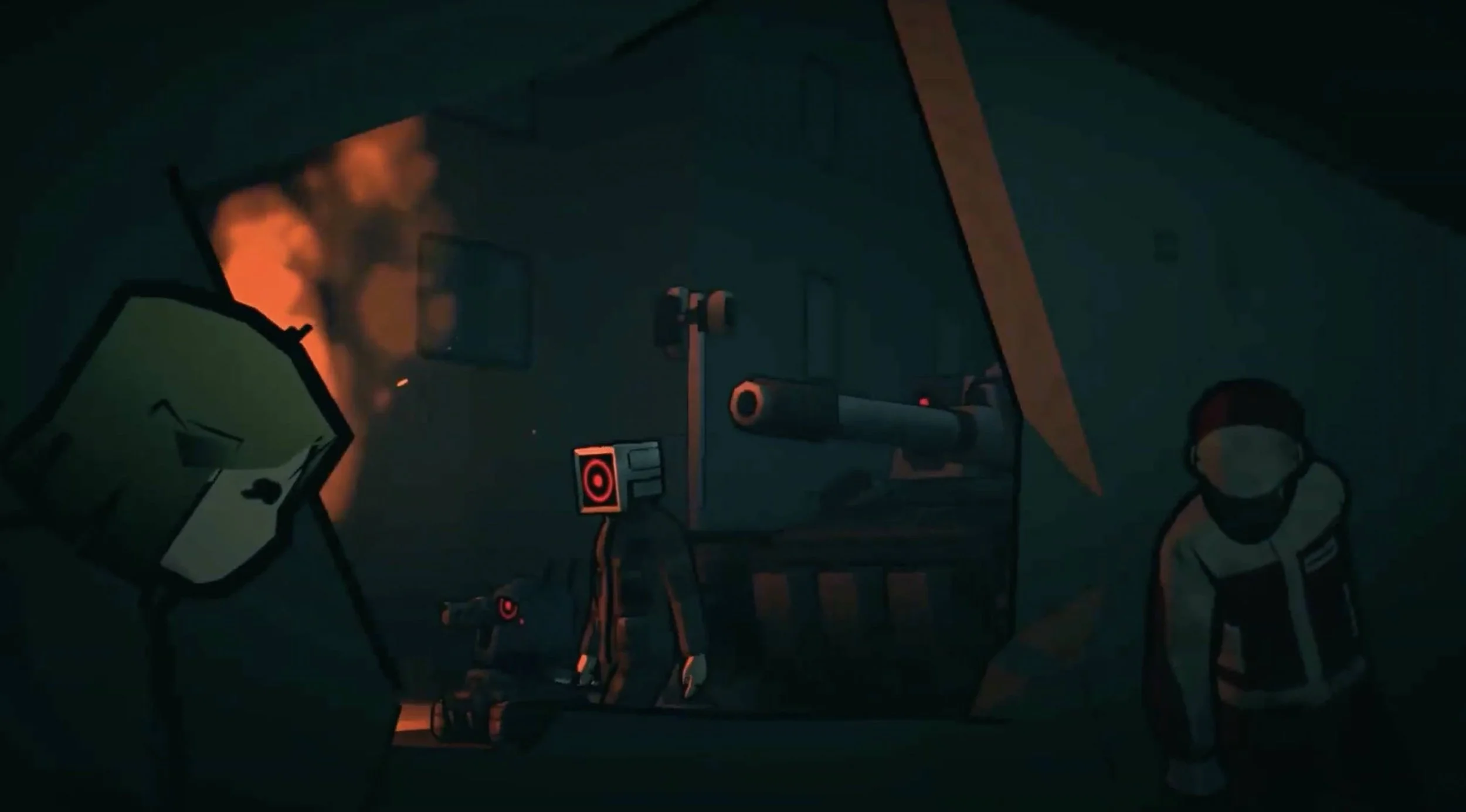
1. Boring. This shot of robot soldiers with hiding people is a cutscene, the art style is fine, but not terribly eye catching. I have no idea what kind of game this is. There is nothing which makes this stand out yet.
2. Boring. "Stranded in a Mysterious Post Apocalyptic World" describes dozens if not hundreds of games. I already want to stop watching, because this card tells me there's nothing original about the setting. Not a single word stands out. This sounds like like AI written title cards.
3. COOL! Flying glowing jellyfish!? I've never seen this image before, and I want to know more! This is a MUCH stronger opening shot.
4. Mostly boring. "You and your team must do whatever it takes to survive." This title card at least has some genre and gameplay indicators. We know there's a team, and that the game has survival elements. Other than that, it's still boring and doesn't stand out.
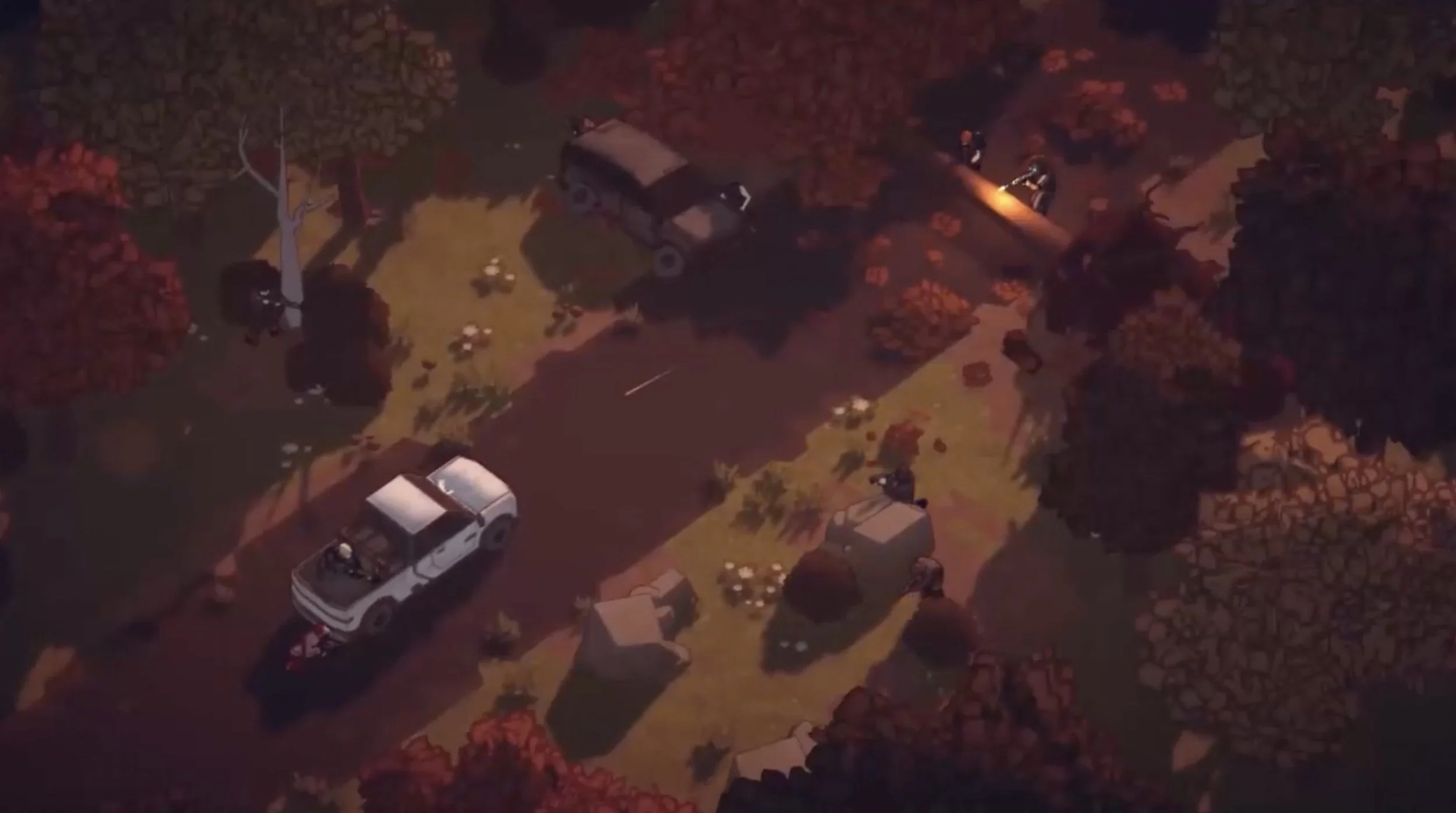
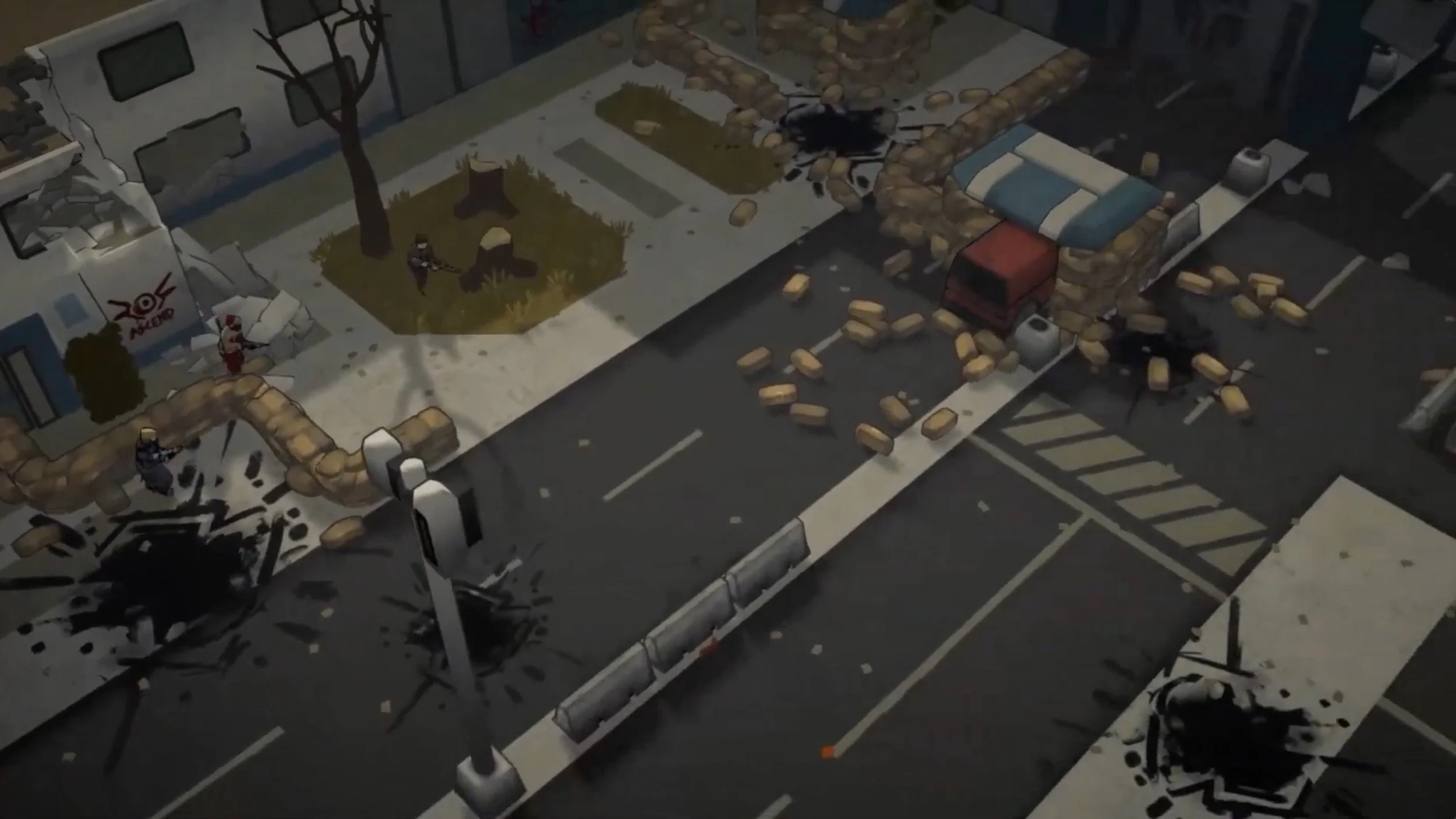
5. Boring. This road with sandbags and people lying around seems to be another cutscene. This looks like an image that would be auto-generated by an AI if you asked for shots from a post apocalyptic game. In other words, there's nothing that stands out.
6. BORING. "Explore a massive procedurally generated world." This describes SO MANY GAMES. There was a time where this might've been a hook, but we are so far past that. It's like trying to sell a new smartphone by saying it has a touch screen.
7. BORING! This road shot with sand bags is basically the same as shot #5, but a wider shot.
This shot is fine, but it was made weaker by following it up with generic trailer title cards
8-9. Boring. "Use stealth to your advantage" is fairly meaningless because we don't yet know what the basic gameplay looks like. It also feels like it doesn't align with the scant genre indicators we have of "team based survival." The following shot shows someone touching a medical pack in a completely empty room. It doesn't look like they had to use stealth. Is this shot related to the title card? If it isn't, that tells me the editor doesn't understand basic editing, which doesn't give me hope for the game.
10-12. BORING! "Gather resources and build your base" describes SO MANY GAMES! The footage also doesn't look terribly distinctive, but at least they match the title card.
13-14. Boring. "Meet new friends" sounds like something I'd see in an Animal Crossing-like game, not a survival game. It's also not unique. I still don't know what the gameplay is, so I can't know how meeting friends will affect it. The shot around the campfire is another cutscene, and without gameplay context it's pretty meaningless.
15-16. Boring. "Defend your territory" is again, so so generic sounding and the shot that accompanies it has no apparent player characters or enemy characters. I can't even figure out who is defending what, and how the player initiated it. Is this a realtime strategy game? Do I control only one character? When the shots in the trailer don't create new ideas, they're either going to be forgotten, or contribute to an overall feeling of confusion or boredom.
A big difference between game trailers and movie trailer is with games, the audience is thinking: “Who am I in this shot?”
17. GOOD! "From the original creators of one of the most heralded Rimworld mods, COMBAT EXTENDED." FINALLY! Some genre indicators and a reason to care! We now know this is a Rimworld-like game. If you're familiar with Rimworld or Dwarf Fortress, this trailer is now speaking directly to you. If you're not familiar, it's probably not for you because if you were into this genre of game you'd probably know Rimworld by now. The title card could stand to be less wordy, AND this needs to be shown within the first 10 seconds of the trailer, not after 43 seconds. Flaunt the pedigree of a game or developer people recognize!
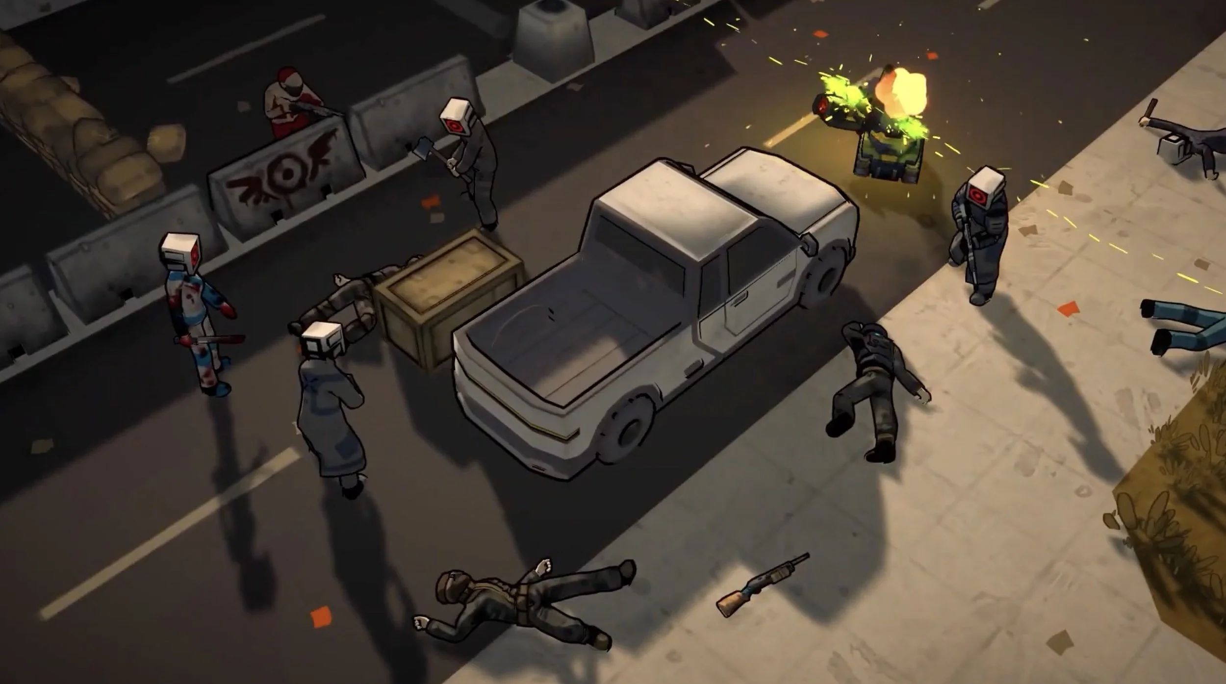
18. Okay. This combat shot SEEMS to show gameplay, but the framing doesn't put us on the side of the protagonist; they're tucked away in the top corner. This might look familiar to people who've played the COMBAT EXTENDED mod, but it's otherwise pretty unremarkable.
19. BORING. "Comes a brand new adventure"? This is just wasted space. I understand this is here to say "This isn't the old mod, this is something new and original." but it's pretty meaningless. Every new announcement is something new, don't waste title cards telling people the trailer they're watching is for something new. They know.
20. Okay. The music kicks in on another shot that looks like a cutscene where characters are running and being shot at. Again, this doesn't look terribly unique and it doesn't appear to be player controlled gameplay. All of these shots need additional context to be at all interesting.
21. Okay. "Increasingly challenging realtime with pause combat" seems to have gameplay indicators, but these aren't making it too much clearer. Also, "Increasingly challenging" is something that's generally assumed in all games which have traditional gameplay mechanics. Without this title card I would've never assumed: "Hmm, but I'm worried all the combat encounters will be the exact same level of difficulty throughout the entire game."
“Cinematic” is a word that gets thrown around a lot. But I think “Clarity” is a better first goal. What is happening here?
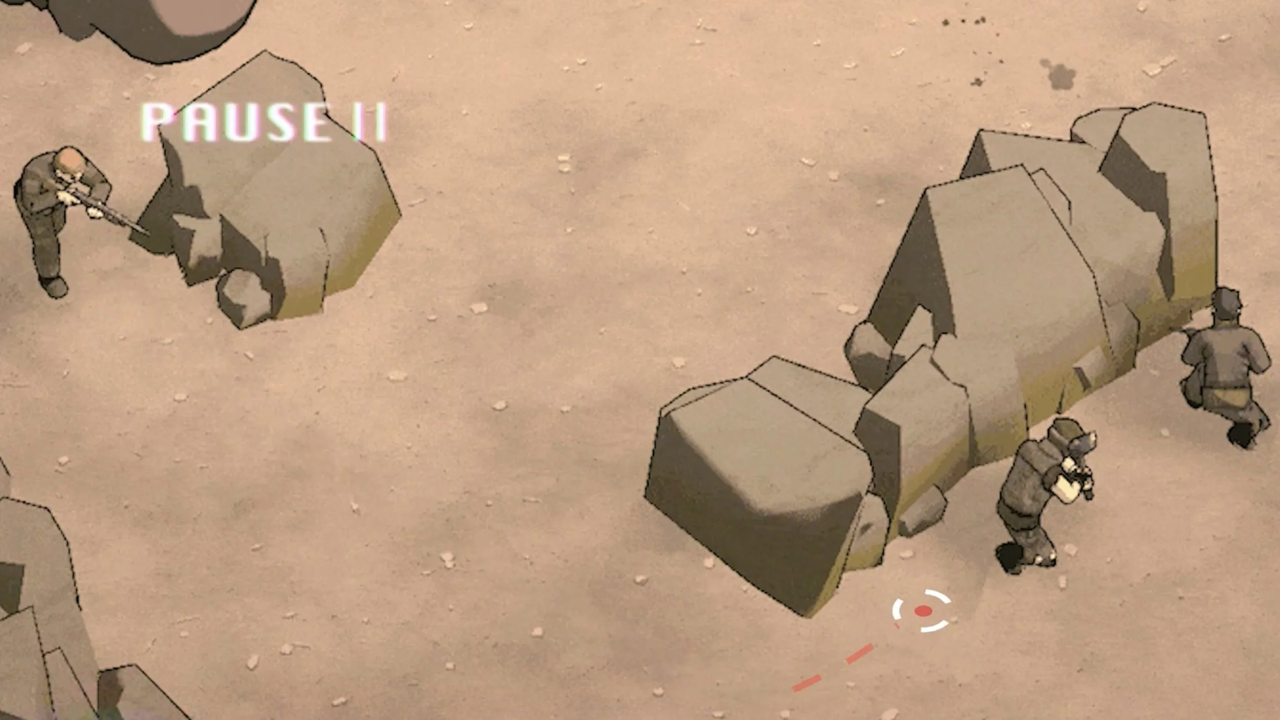
22-23. Pretty good. I like that we're finally seeing some gameplay. It looks like sort of similar to Transistor, you can pause the game, decide what to do next, and then resume. Though at over a minute in, this is WAY too late to show first gameplay. The music pausing also ruins the momentum of the trailer, so that should be avoided.
24-25. Pretty boring. "Dynamic enemy AI" sounds like a baseline feature for a game, not a selling point. I would not have assumed the opposite (terrible, boring AI) had this trailer not mentioned it. At least the footage is something I can recognize as gameplay and I see how the enemy characters flank the player character.
26-27. BORING!!! Vehicles!? Is this a selling point for a Rimworld-like game? Even if it is, it doesn't sound terrible interesting. Even if this were for a game which typically doesn't have vehicles, like Super Mario Bros., just seeing footage of the vehicles would be enough. Using a whole title card to point it out is very uninteresting. The gameplay again, doesn't seem terribly intriguing or visually distinct.
28. Not bad. This is apparently a quote from a well known developer from Rimworld, and the idea of this being an advancement of the genre at least indicates this has SOMETHING new to show. This should also be much sooner in the trailer because it's social proof. Though the quote would be better if it was shorter.
This shot on its own isn’t terrible interesting, but because it has information we want/need, it’s much better than most of the rest!
[Text montage]. Mostly boring. This montage of text has a mix of incredibly generic stuff, and a handful that stand out. My most generous read of the boring stuff is the editor is trying to be funny by pointing out mundane things like furniture. The boring stuff needs to be removed so the unique things like Mechanoids, Alien Drugs, Mech Hacking can stand out. All the other things like: weapon combos, voice acting, pets, and quests make the whole thing sound generic.
When you talk about your game by mentioning all its commonalities to other game as if they were selling points, it tells me your game doesn't have anything unique. Show, don't tell. ESPECIALLY when it's for very common game content.
The final reveal with the monster is pretty good. It's a long standing cliché to end a game trailer with a giant monster roaring. I still find these ending shots fun, but the misstep here is announcing it with title cards before showing it. I guess the editor was trying to be funny, but I think the trailer hasn't earned a 4th wall breaking humorous tone, so it might as well be removed in favor of just showing the giant monster.

If the player isn’t someone in this shot, its not going to be as interesting.
Before talking to the publisher, I had to understand what the game's hooks were in order to fix up this trailer. Before that conversation I knew the trailer had to open with the most distinctive visual (the flying jellyfish) and front load information about the genre and pedigree about the game.
The publisher indicated the hook of the game is that it's Rimworld, but with a combat system which doesn't exist in the original game. This alone was a good start, but still not really enough to carry the whole trailer. The combat mechanics are a means to play the game, but don't point towards a goal. The mechanics help you achieve goals, but the trailer has no goals. Here's the final trailer, and a walkthrough of its new structure which uses all of the same footage.
The trailer opens with flying jellyfish to hook the audience. This is a very difficult genre to define, so we used the brute force of a title card that says: "A NEW COLONY SIM" to clearly indicate this is a Rimworld or Dwarf Fortress-like game. Three seconds in, we know the genre. Previously, it took about 44 seconds.
Next, the previous shot of the people hiding from enemies shows a bit of the world (but without the generic title card saying it's a post apocalyptic world). Without the trailer spelling out the setting, the shot is a bit more compelling. Also, with genre context, our brain can use this shot to extrapolate a vision of the game. Previously, this shot had no context, it was just a shot followed up by a boring title card. Editing is all about setting up and creating connections. This shot sits atop a clear genre and a hooky opening shot.
8 seconds in, the trailer touts the pedigree of the creators making this popular Rimworld mod. The mention of Rimworld cements the genre, and puts out a call to those who played the original mod. For those unfamiliar with the mod, they at least know it's a Rimworld-like game that somehow has something related to combat. The following two shots show combat. They still aren't super strong because we don't see them from the player perspective, but the shots that come after which show the pause-combat provide some more context. This gameplay is 18 seconds in, instead of over a minute in. The trailer then reinforce the combat's unique qualities with the Rimworld developer quote, followed by more gameplay.

While writing this I spotted a cute beast of burden in this shot. Why did I not get to see it more closely!?
"A massive, unforgiving world" is admittedly not an original title card, but this sits atop the foundation of the genre, and unique gameplay mechanics (for a Rimworld style game, at least). Therefore, this title card is a promise of longevity and content. It also avoids dry game design-y terms like "procedural generation."
The following shot of the vehicle serves a new purpose by indicating the world is so big, vehicles are necessary to traverse it. The vehicle is more interesting because now it has utility. Previously, the trailer just said "Here's this thing" which was meaningless without knowing why we need it. A lot of game trailers make the mistake of pointing out STUFF without setting up a reason it needs to be in the game.
Next is a new series of title cards: "How will you lead your colony? Will you be a compassionate leader? Or a chaotic one?" This is the high level player goal I previously mentioned which was lacking. The shots which previously served little to no purpose can be paired with each title card as an example of the end result of each choice. What follows is a short montage of gameplay, which with all the previous setup seems to give us a look into what playing the game looks like.
Then a list of things which sound far less generic, and much more specific to this game. There are still a few which don't stand out, like "Trade" but since the majority stand out, I think it's ok. The text montage ends with "Modder friendly" because the publisher told me this is a really key point. Previously, this title card was given the same weight as the less interesting features, but it's the last one here so people don't miss its significance.
Then with no preamble the trailer ends with the giant monster!
If this is a shot in your trailer, you better hope it has some gameplay context or something to draw our eye to an interesting detail.
So that's how I helped take an incredibly rough first draft and turned it into a trailer which has an impressive 14,000 likes and over 500 comments on YouTube!
Kudos to the publisher and their editor for taking my tips and making a much stronger trailer. I feel like most online discourse and tutorials about editing focuses on the minutiae of using the software, and techniques like flutter cuts, J-cuts, and L-cuts. But by far the most important part is how to structure the story; it can literally make the difference between a video I want to stop watching three seconds in, to one where I watch the whole thing.
For game trailers, you almost always want to establish the genre as soon as possible!!! Even if it's just one shot that precedes a bunch of cutscenes, it makes a WORLD of difference. I prefer to never show story-lore for much more than a few seconds before cutting back to gameplay.
Whether it's fair or not, your trailer can be a reflection of your game's production value just like the capsule key art image is. You could be the most amazing game designer, but if your trailer doesn't measure up, it might set off alarm bells in the audience. There are of course exceptions for games whose art, animation, music, and design are SO good, people look past the poor editing of the trailer. But if you know your game can't stand on those things alone, your trailer needs to be top notch. Here's my consultation page if you're struggling with your trailer's structure and/or creative direction (Shameless self-plug).
