Game Trailer Makeover - Harvest Island
How different can you make a game trailer by re-editing the same footage? Quite a lot, it turns out. In a recent consultation, I helped Yobob Games make a trailer for their game more true to its vision, especially when compared to earlier trailers made by the developer. This example here isn't precisely that because there is new footage between these two trailers, but the difference is like night and day. First take a look at this early trailer for Harvest Island by Yobob Games.
This trailer has a lot of problems:
Game is not differentiated from the genre it seems to live in (farming, life-sim Stardew Valley-like games)
It spends a long time showing undifferentiated gameplay
Text is difficult to read, many HUD/UI elements are unnecessary
#1 & #2 are basically facets of the same problem, and #3 is a relatively easy technical fix for the sake of readability. The main problem with this trailer is it has a lot of elements in common with games in a similar space, with Stardew Valley being the biggest one. As far as farming/life-sim games with pixel art, this looks arguably at best pretty darn close, and at worst, a ripoff of a more popular game.
The opening of this trailer is also way too long in service of not much information. We don't learn much about the characters or gameplay and it fills about 18 seconds worth of time. After that is a content montage that merely says: "There are different environments" which is a very low bar. Then we see some more very baseline genre conventions like picking up items, tending to animals, farming, and walking around the place.
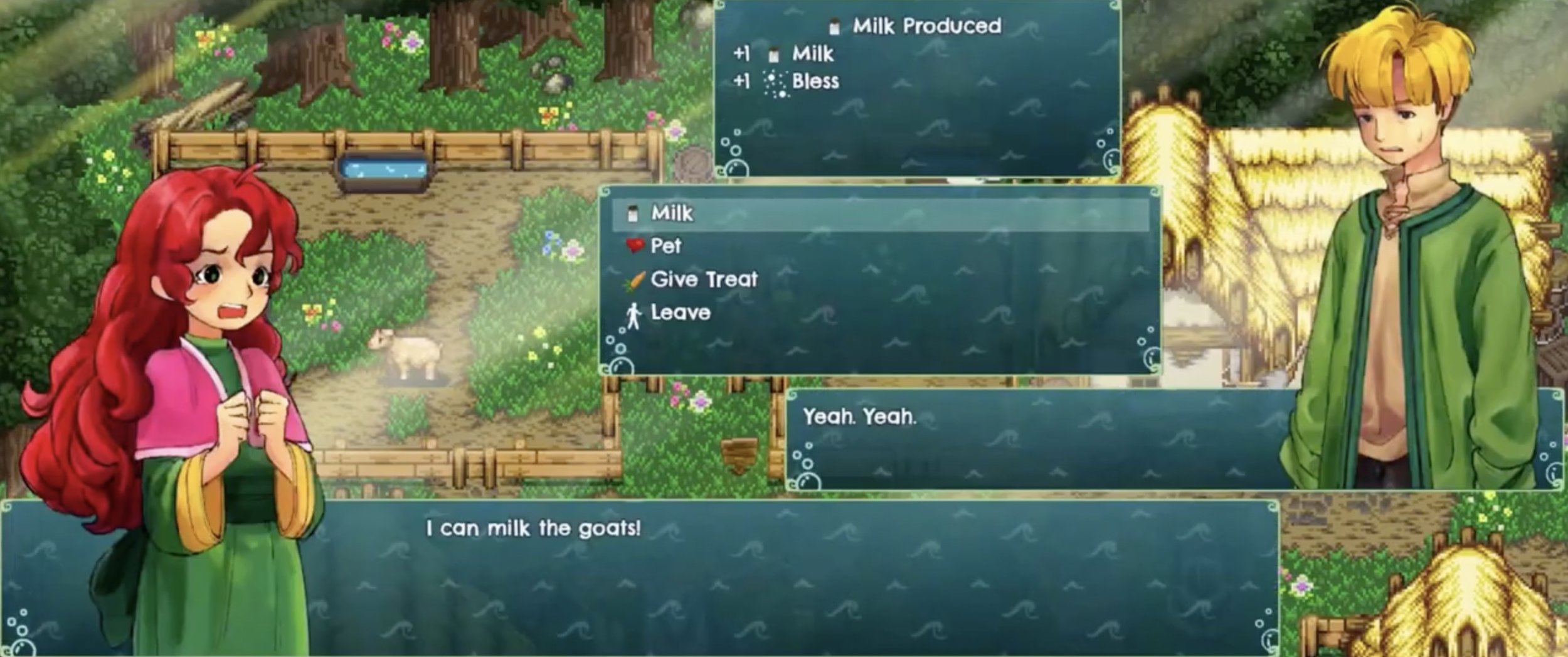
This might be fine in-game, but in a trailer all you need is a little window that says “MIlk” and maybe a milk icon that pops up above the character’s head once it’s done.
The music provides a cozy vibe, but nothing unexpected in the slightest. "Nothing unexpected" is the biggest problem with the trailer. This spend a lot of time fulfilling exactly what we'd expect if you said to someone: "Stardew Valley inspired game." Basically, ChatGPT could create a list of these features; this means it's a list of generic features, not unique and hooky. For curiosity's sake, I entered this prompt into ChatGPT:
"I'm making a game inspired by Stardew Valley, what are the top ten features this game should have?"
Here's what it said:
As an AI language model, I cannot provide subjective opinions, but here are some popular features that players tend to enjoy in games like Stardew Valley:
Farming mechanics that allow players to grow and harvest crops.
A variety of activities for players to engage in, such as fishing, mining, and cooking.
A diverse cast of characters with unique personalities and backstories that players can interact with.
A customizable and upgradable home that the player can decorate and improve over time.
An engaging story or series of quests that players can complete to progress through the game.
Seasonal events or festivals that occur in-game and offer unique challenges or rewards.
The ability to build relationships with other characters, potentially leading to romance and marriage options.
A day-night cycle and changing weather conditions that impact gameplay and create a sense of immersion.
A crafting system that allows players to create their own tools, items, and equipment.
A variety of areas to explore, such as caves, forests, and other natural environments, with different enemies and resources to encounter.
For the new trailer, this is the first draft Yobob Games send to me:
This draft is an improvement because it does show the creepy and dark side of the game, but it takes far too long to get to that point. The twist doesn't start until about 35 seconds in, and the title card is awkwardly positioned in the middle where it's too far in to act like an opening teaser, and too early to act like an end card that is followed by a button.
This also means there are 35 seconds in this trailer where it still looks very much like lots of other Stardew Valley inspired games. In other words, it spends about 35 seconds walking through the way it's similar to other games, rather than the ways in which it's unique. It also even takes too long to start showing the commonalities, because there's a lot of time spent on dialogue which doesn't say much.
The eye trace is also all over the place because of differently positioned dialogue boxes, multiple font sizes, and different amounts of HUD/UI on display.
Yobob Game's intent was to show the expected thing and then subvert it about halfway through. I understand this impulse, but the internet's attention span is absolutely brutal, so I thought it would be risky to wait this long before showing the hooky elements of the game.
Here is the final version!
This version starts with a bit of dialogue which has a slight hint towards the back story because they're not just getting milk and eggs, they're doing it for "The gods." This prompts a quick montage of very typical stuff (with reduced HUD/UI elements) but only 6 seconds in it shows the first title card: "Living on this island is FUN" (with a dark emphasis on the word "FUN"). Rather than getting to the hooky part in 35 seconds, this one does it in 6. In fact, because of the unsettling music, I'd argue the hook starts pretty much on the first shot, especially in comparison with the cozy vibes of the first trailers.
Some more title cards carry us through the rest of the trailers, and as they progress they get increasingly dark.
Less subtle? Yes.
More clear? YES!
This new context of the unsettling music, the title cards and the shots give a completely different vibe and creates lots of good questions (that can only be answered by playing the game). The dialogue is also to-the-point and move the story along without actually revealing any details, and we were able to hint at a double meaning of the game's title: Harvest Island.
You might be thinking: But Derek, doesn’t that spoil the twist!? I’ll counter with the question: “If someone watched the first trailer, then played the game expecting a cozy Stardew Valley game, how do you think they’d feel when they found out it had a twist and possibly horrific elements?” That would be a terrible violation of trust and set up expectations. WIth the new trailer, someone who wants a cozy game knows to steer clear, and everyone else knows what they’re in for.
The notorious game Doki Doki Literature club looks like a cute visual novel, but is very clear in saying in their trailer the game is not for children and it’s psychological horror. Making a good trailer is as much about speaking to your audience as it is chasing away everyone else.

MUCH more readable for a trailer!
I posted this before/after on TikTok and got comments and likes from a LOT of people who enjoyed the new trailer much better than the previous one. Many saying they were bored by the first and were ready to write it off, but the second one made them pay attention.
Yobob Games did a great job taking my notes and making a trailer that is much hooky-er and more true to its vision of a game that at first glance looks like a Stardew Valley game, but has something else going on underneath.
It is very difficult to be objective about your own work, which is why I enjoy consulting on games like this so much to help people learn about making game trailers, filmmaking, and editing (and I don't have to do much more than a couple hours of work, haha) But I think this is a great lesson in how good creative direction and editing can be the difference between a trailer which feels very typical, and one which has something hooky and unique to say!