Guide For Captions and Subtitles
Captions are more important than ever for trailers and other online videos. Firstly of course for the hearing impaired, but also because many video players now default to muted audio. A lot of people never unmute the videos they watch at all!
The terms captions and subtitles are often used interchangeably, but they are different things! This article sums it up well, but in general captions are made for people with impaired hearing and include descriptions for things not seen on screen like "[door slam]," and in some cases can be turned on/off depending on where you're watching the video. Whereas subtitles are for translating spoken languages.
For the purposes of this article, I'm going to use the word "captions" because their use in trailers and social media isn't typically for translation (Also, if you want to do further research for tutorials and guides, the majority seem to be about captions)
Recently I saw this tweet which I couldn't agree with more:

I have a whole host of criticisms of captions in games which aren't the subject of this post, but a lot the best practices I'm going to mention here apply to games too, because it's the same goal of allowing people to read what is being said.
There are so many ways you can caption videos other than text on the lower part of the video. I think there's still a lot of room for experimentation with the format, but the thing we shouldn't forget is captions are meant to be READ. If your captions are too hard to read, it's time to start over.
It might seem cool to have captions with fonts which are handwritten, science fiction-y, gothic or otherwise themed to match the aesthetic of the game, but it defeats the whole purpose if legibility is lost. Captions can be made with both legibility and style, but careful design considerations need to be made in order to do it successfully.
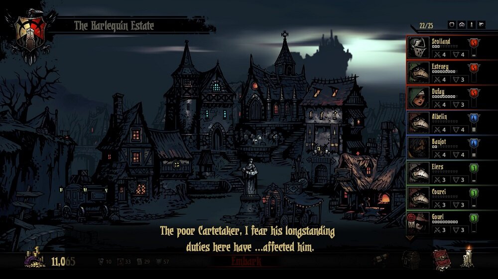
This typeface from The Darkest Dungeon fits into the world, but isn't super legible
I first want to cover the most basic of captions, because a lot of trailers and videos fail to get those right. Years ago I worked at an anime DVD production house, and I came out with strong opinions about what made good captions. Even big companies like Disney put out DVDs which have terrible captions (I'm side-eyeing your Studio Ghibli DVD releases, Disney!)
Here are the main focuses I'm going to break down for the most basic captions, roughly in order of priority:
Contrast
Chunk-ing/Spacing
Timing
Refresh Rate
Contrast
Captions need to contrast with the background in whatever way is best for the video. There are a few ways you can increase contrast:
Color & Value
Text outline or drop shadow
Backgrounds
Most captions you see online are bright white or yellow, and depending on the video it's displayed with; this might be enough, but this approach runs into problems if the background image is very bright, and the captions blend in. When I grew up watching Jackie Chan films in theaters or on VHS I constantly ran into problems where I couldn't read the entire caption because of something white in the background.

Austin Powers: The Spy Who Shagged me had a gag about subtitles which blend in with the background.
The next approach which is still relatively unobtrusive is adding an outline to the text, and maybe even a slight drop shadow. I start with an outline and add a drop shadow only if necessary, and again try to keep it as unobtrusive as possible.

I ran into time constraints for these localized versions of Neo Cab's trailer otherwise I would've replaced the text in the word bubbles, but the subtitles have an outline and slight drop shadow plus yellow to contrast the very cool and purple color palette.
The last, most brute force approach is to add some sort of background text box which is either entirely opaque or translucent. Traditional TV captions have an opaque black box, but some modern streaming platforms and video games allow you to customize it to your liking.

A lot of video games have backgrounds for their captions. Amazon Prime also has a lot of options for how to display captions.
Of course, for your trailers or video you probably want the least obtrusive approach possible so the audience can see more of the video, but if captions are necessary then it's up to you to find the appropriate balance.
Chunk-ing/Spacing
Captions should NEVER be longer than two lines. If it's going to be longer than two lines, better to break it up into multiple captions, and end the first with either an ellipses (...) if it's in the middle of a sentence, or if there's a comma I'll often end a caption there, and then continue on the next one.
Video games are especially guilty of violating this two line rule; sometimes they display walls of text 3-5 lines tall! I don't know the reason for this, but I suspect it's because the game is put together with one audio file per caption. So very long unbroken audio files are matched with correspondingly long captions (If you're a game developer and know whether this is correct or incorrect please let me know!)

This... is too much text for a single caption.
In my research for this post I found 30-40 characters per line is the generally accepted ballpark for captions. This article has some more in-depth reading, and Netflix even has language specific guidelines for how many characters can be displayed per line.
Timing
Captions need to be timed in a way which allows for smooth and easy consumption of the information. When captions are not in sync with what we hear (even if it's a language we don't understand) this can disrupt our flow. Captions which start too early can be frustrating because it's almost like a spoiler for what is about to be said, and captions which start too late make us feel like we're a step behind the narrative.
When I time my captions I try to start them as close to the first frame of audio as possible, or sometimes just a couple frames earlier. The exceptions I make are for when the beginning of a subtitle lands on the last few frames of a shot. In those cases I sometimes cut off the first few frames so the new subtitle can start on the new shot.
For the end of the subtitle, if I have the time I try to leave it on for a beat after the line finishes because sometimes the line is said quicker than the audience can read.
Refresh Rate
I don't think this an actual term in captioning, but one big rule I learned was about how much empty space to put between captions. Videos which are 24-30 frames per second should have at least 2 frames of empty space between consecutive captions (for 60fps videos, just double the amount)
The reason to put empty space in between consecutive captions is so the audience can see in their peripheral vision the caption swapped out for a new one. Reading captions means constantly moving your eyes back and forth between the bottom and the top of the image, so if there's no empty space between the two captions, the audience might think it hasn't changed at all and miss the new one!
Similarly, if a new caption starts very close to the beginning of the shot, I make sure to not start the caption until at least the 3rd frame (for 60fps start on the 5th frame) This is also to avoid the audience not noticing the caption is there. If a caption is already on screen when the new shot begins, the audience might not notice it, especially if the caption blends in with the shot either because of color or composition.
Phew!
Beyond these basics there's a lot which can be done with captions. You sometimes see elements of this on sites which share a lot of videos on social media like The Dodo which will sometimes have lightly animated text in their videos.
The Dodo uses a mix of lightly animated captions and some which are integrated into the upper portion of the video as well!
Or consider the master of on screen text, Japan! If you've ever watched Japanese TV game shows or shows with a lot of people talking, it can feel like just about EVERYTHING said is displayed on screen, often in big stylized text. The anime Neon Genesis Evangelion does this sort of thing all the time too. Again, legibility is most important, but this sort of style can make the captions part of the video itself.
This is from a segment of a show where they were trying to see just how heavy a fish these stray cats could drag away :3
Years ago I made this version of the BattleBlock Theater trailer for Steam because it was going to play on loop on a screen above The Behemoth's PAX booth with muted audio. This was when I was heavy into kinetic typography, and in some cases it might be a bit too fast to read, but I think still serves as an example of how text can integrate into a video. This sort of on screen text is a LOT more labor intensive, but can be very fun to watch if you're willing to put in the effort
Something to beware of is how much cognitive load you're asking of the audience if the captions are burned into the video. For example, I frequently see trailers for Japanese games which have subtitles to translate the voiceover, and on top of that include more story text on screen at the same time.

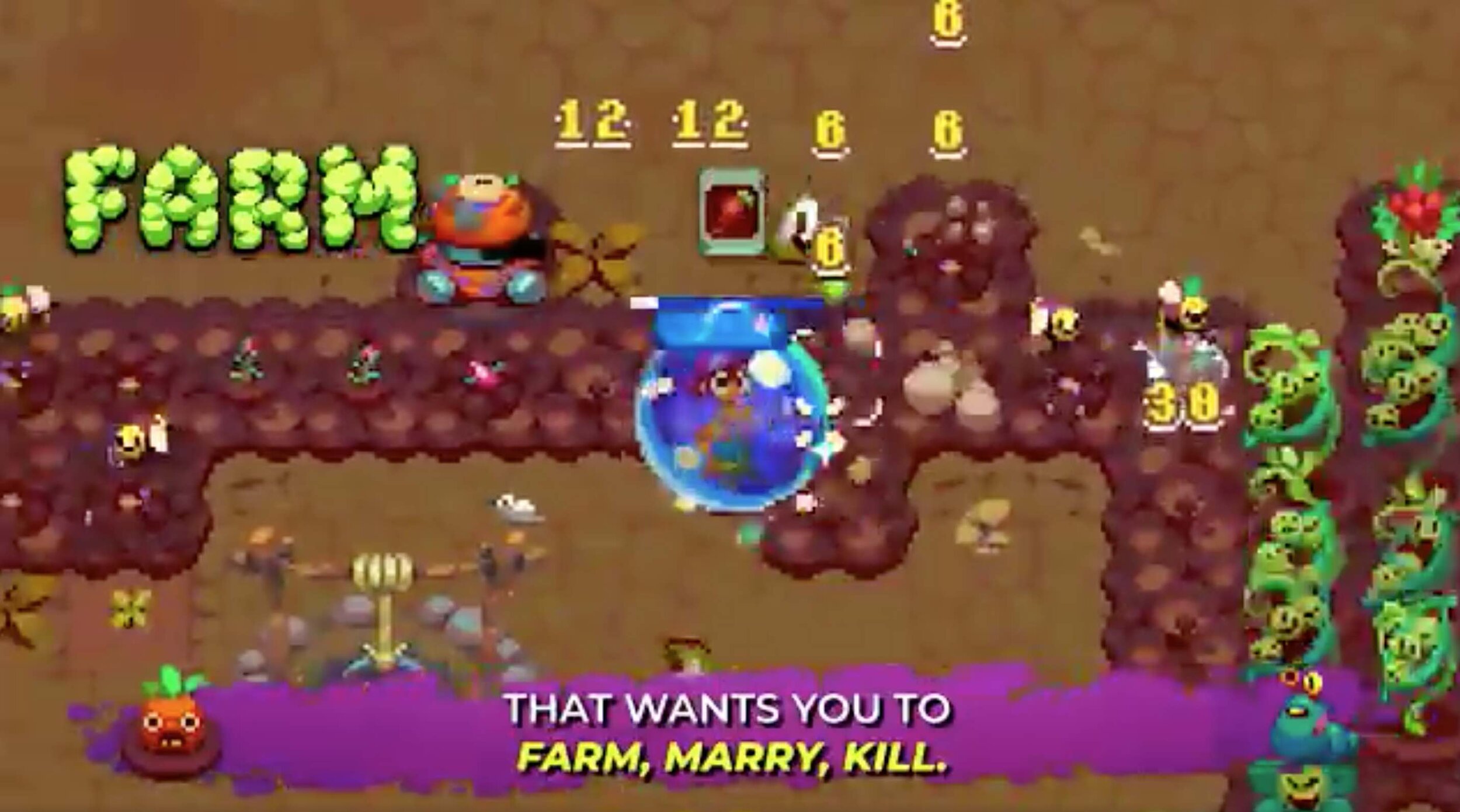
This is way too much text for one screen even if the subtitles weren't there.
I recently saw this trailer for Atomicrops on Twitter which based on its use of explainer text I assume was specifically made for social media. The problem is it's layered on top of video which has its own text competing for attention, which means there are times there's redundant text or just too much text on screen on any given time to allow for a smooth viewing experience.
Rules of thumb:
Keep captions as short as possible, 2 lines maximum.
Legibility is ALWAYS the priority, style is secondary.
Captions need to contrast with their background as much as possible for legibility. Consider color, outlined text, and mild drop shadow (or all combined)
Consecutive subtitles should have a few frames of empty space in between them so the audience can see the subtitle has refreshed. At least 2 frames for 30fps and 4 frames for 60fps.
Start caption on the frame the dialogue starts on (plus or minus a few frames). If the first frame of dialogue happens to be on the last few frames of a shot, then it might look better starting on the third frame of the new shot (building onto rule #4, it's better for a subtitle to appear rather than already be there on the first frame).
If you have captions burned into your video, make sure there's no on-screen text competing for attention, or just as little as possible.
Include names of speakers. For example “RAZ: It was, a woman. Commanding serpents of water!”

Even this GIF's subtitles would've benefited from color contrast as well as the second subtitle appearing on screen a few frames later so it's clear a new subtitle displayed.