Elevating Your Trailer Editing - Baseline
If you're a beginner looking to improve your trailer editing skills here are a few concrete things you can do which will do a lot to elevate the quality of your videos. These are telltale signs I see in videos which make me immediately suspect they were made by a less experienced editor. The good news is a lot of them are pretty easy to fix!
Poor Dialogue/Music Mixing
When the volume of the music doesn't lower or "duck down" during dialogue, that's one of the surest signs of a less experienced editor. This makes it much harder to hear the dialogue, especially if cut to bombastic trailer music.
It's a simple thing to fix by learning how your video editing software modifies the volume (audio gain) of clips or tracks. Usually it's done via a pen tool and keyframes or the quick and easy cut & fade technique which I use.
Whatever technique you use, just make sure the music's volume is lower during dialogue than it is when music is the only audio playing.

Professional sound mixers will likely not endorse this method final mixes, but for video editing, cut and fading between clips with different audio gain is a great technique!
Video Filter Festival
When a trailer seems desperate to use every single video transition effect available in the editing software, I can pretty much guarantee it was made by a new editor. These transitions are things like: cross zooms, cube spins, page turns, flips, pushes, spirals, water ripples, venetian wipes, clock wipes, star wipes, iris wipes etc.
I totally understand this impulse, because when I first got my hands on editing software I was also incredibly tickled by how easy it was to create these video transitions. They're cute, but typically have very purpose in film language other than to look cheesy and amateurish. At worst, these make a trailer look like it's trying to hard to look cool because it believes the material needs jazzing up.
My solution for this is to just not use any of those video transitions and filters. I think most experienced video editors will give you the exact same advice for the same reasons. You might think they're making the edit look more impressive, but it's sort of like trying to make a resume look longer with flowery language when you have very little experience.
There are a number of other game trailers I could cite as an example, but this is the most recent one I've seen. The effects draw attention away from the game!
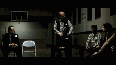
Flash Frames
This is when a few frames of footage get stuck in between clips because maybe the editor didn't properly overwrite a clip while they were editing, or they're using downloaded source material like an official trailer which has multiple cuts in it, but when viewed on a timeline appears to be one clip. Flash frames are very common in video essays or fan trailers which rely on repurposing movies and other edited material.
The simple solution is to watch the final export very carefully and look for single frames of footage which don't belong. The more thorough and menial solution is to watch the trailer frame by frame to make sure there are no flash frames.
This is not technically a flash frame because it's only part of the shot, and it's a deliberate choice from the filmmaker, but you should get the idea.
See & Don't Say
This is when a trailer mentions a thing via narration or title cards, but then doesn't show the thing afterwards. A simple example is if a title card said: "AMAZING BOSS BATTLES!" but all the footage afterwards had no boss battles in it. You might think this pairing of a title card and corresponding footage would be obvious, but I see a surprising number of trailers which fail to do even this simple juxtaposition.
The Kitchen Sink
A lot of trailers simply try to cram in too much information like: story details, title cards, subtitles, game UI screens, game features, character names etc. I think this stems from the belief a trailer is intended to be the ONE marketing asset potential customers will ever see, and therefore is responsible for answering all the questions.
I also put into this category trailers with a lot of extraneous content per shot. For example, dialogue bubbles which aren't there to contribute to the trailer's story or HUD elements which don't help to significantly illustrate the game's design.
The solution to this is to pull back the information within a shot until removing any more would make it lose its meaning. This can also be applied to entire shots of a trailer. If a shot in the trailer does not contribute anything to the edit, then that's usually a sign it needs to be reworked or removed.
I put this one last because this takes a more experienced eye to judge how much is too much for a trailer and one person might deem a shot with voiceover, title cards, and subtitles to be perfectly ok.

Even as a screenshot, this frame is a lot. As part of a trailer, it's a big ask to expect the audience to be able to parse this shot.
If you're a new trailer editor, I hope you learned something from this mix of tips, and if you're looking to hire an editor this should help you evaluate the quality of a person's portfolio or YouTube videos. There are certainly more pitfalls I can think of, but these five represent a big gap between a beginner and intermediate editor. In the future I'll probably do another post for what it takes for an editor to take the next step up from here!
